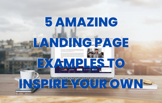
Learn what makes a great landing page by looking at five examples from e-commerce, SaaS, app, and local service sites.
What is a landing page?
Landing pages are effective, aren’t they?
When we click on an ad, the landing page tells us what we need to do next. Moreover, it should make you double-take and exclaim, “I must have this!”
It can also be unsuccessful and go viral for the wrong reasons. (I’m looking at you Rainbow Capital.)
Good landing page design lies at the intersection of art, marketing, and psychology. Also, if you’re reading this article, you’re likely looking for guidance and ideas to enhance your own search landing pages.
That is precisely what we will do.
We’ll talk about what makes a good landing page and give you five examples to look at.
5 Examples Of Search Landing Pages
A great search landing page will make visitors feel like they’ve found the right business (or product).
The best way to understand what makes a great landing page is to look at real-world examples.
Here are five fantastic landing page examples.
1. ASOS
As one of the most valuable clothing brands in the world, ASOS competes with brands like Nike, Adidas, and Zara.
This means that those marketing techniques that online retailers can use must be based on something really unique.
Let’s look at what they are doing well.
I searched for “wedding guest plus size dresses” and saw an ASOS ad that led me to a page with plus-size dresses for Americans.
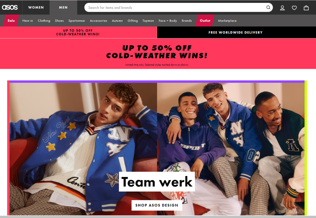
I love it when ads take me to relevant landing pages.
Full-length thumbnails of plus-size models in dresses let me know I’m in the right place, and I can imagine myself wearing the item.
Breadcrumbs in the top navigation let me easily find curved clothing. Also, filters let me narrow my search by price, color, and eco-friendliness.
The lack of fluff in the sales copy lets the user focus on the product (in this case, clothes). The category page’s description does make mention of the brands to look into for current fashions.
Overall, the landing page is neat and orderly and keeps the focus squarely on the product.
By adding a filter based on user reviews to their landing page, ASOS may want to test adding social proof. They might also want to make people feel like they’ll miss out if they hear that an item is selling fast.
2. DRIFT Landing Page
Conversational marketing and sales technology company Drift focuses on B2B sales with its live chatbot.
One of the few Latino-founded businesses to ever reach a valuation of over $1 billion in this one.
According to Drift CEO David Cancel, “Our purpose as a company remains simple and consistent: Build a platform that makes it easier for customers to buy from you.”
Check out the Drift live chat landing page and see how easy it is to purchase their product.
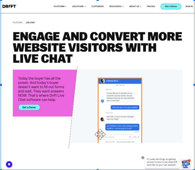
It looks so good on all devices, and I am totally geeking out over the bright, minimalist design (with a hint of the 1990s). Moreover, with Drift’s “live chat” solution, we see a big, bold headline above the fold that states right away how the app helps business owners “engage and convert.
The content block that follows the headline explains why users are not clicking through or making a purchase: “Today’s buyer doesn’t want to wait.”
The CTA that encourages website visitors to “Get a Demo” has a nice contrast color.
The header image is ten times better than a stock photo and features the product.
Also, I want to draw your attention to the shield icon in the bottom left corner, which opens the privacy settings. This small change will make it clear to people who visit the website that the company takes data privacy seriously.
As we continue to scroll down the page, we come across social proof in the form of a senior director’s video review of a major global marketing operations and technology company.
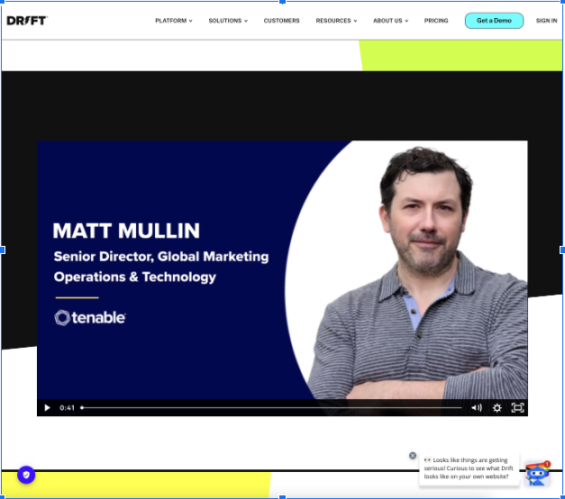
Get video reviews if you can! They are very difficult to fake, which makes them significantly more engaging than a typical text review.
3. LawnDoctor.com
Lawn Doctor does pest control and takes care of lawns, but it is not a typical landscaping company.
With more than 630 locations, this lawn care brand will have 16% more sales in 2020 than in 2019.
Local service providers can pick up a lot from the landing page of Lawn Doctor. Let’s examine how they created their landing page to draw in new clients.
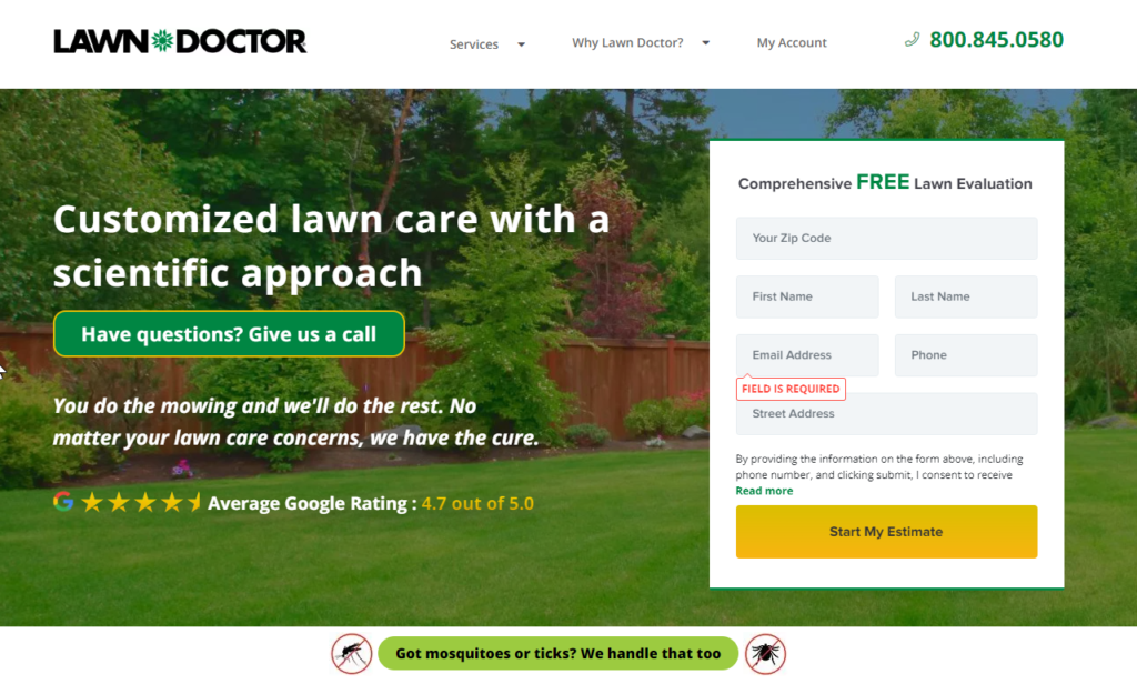
The Lawn Doctor is a fantastic illustration of a neighborhood service provider. Also, the color scheme uses a deep shade of green that customers want, and the hero image is the customer’s dream backyard.
The 4.7-star average Google rating overlay on the image represents social proof. The precise value of 4.7 is useful because it feels like a true number rather than an estimate.
Users don’t have to scroll down to find the estimated form, and for those who don’t want to wait, a phone number is provided in the top right corner.
The city and state are automatically filled in for me when I enter my zip code into the form, which is great because I tend to get lazy and not want to enter all the information.
The header of the sales copy states that you will receive scientifically based, customized lawn care.
I get the impression that I’m receiving better service than I would from anyone else because of the word choices “custom” and “scientific.”
The Lawn Doctor upsells me services that are highly pertinent to the current season below the header image but above the fold.
I can click on that CTA to learn more, but if a sales representative calls, I’m more likely to inquire about it.
4. Flywheel Landing page
Flywheel was acquired by WP Engine in 2019.
Although the deal’s financial details were not made public, Heather Brunner confirmed in an interview that Flywheel had $18 million in annual recurring revenue at the time of acquisition.
What contributed to Flywheel’s success? The business did a great job of marketing itself and had a great managed WordPress hosting platform. Take a look!
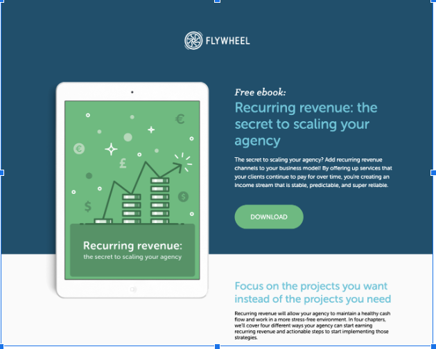
The top navigation is not present, helping the page visitor stay focused on the content you want them to.
Visitors to the website are reminded of their location by the logo, which is clickable and offers a quick way to return to the main domain.
The lovely color scheme with the contrastive call-to-action button above the fold in money green and calm business blue.
The word “free” is used in the headline to let readers know that the download is free.
Text is segmented into manageable reading units for mobile devices.
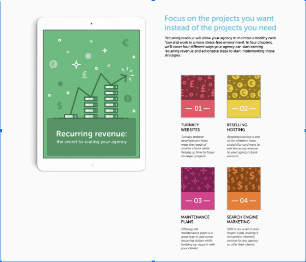
I can see a brief summary of the chapters below the fold before providing my personal information. I can tell if it’s worth it or not by how it makes me feel.
The final CTA at the bottom of the landing page reiterates how totally free and packed with insider information the ebook is! The file is a brief and uncomplicated business email.
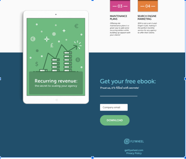
My visit to the product home page follows the confirmation of form completion. Overall, a lovely ebook landing page that lead-generation businesses can emulate.
The only thing I can think of to “seal the deal” is to place social proof close to the bottom CTA.
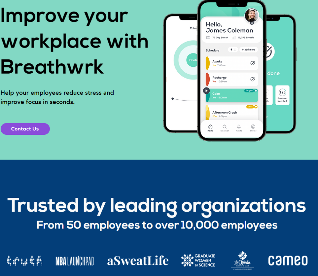
5. Breathwrk
The startup Breathwrk was founded by women, and it raised an undisclosed sum from ten investors, including Demo Lovato and BAM Ventures.
Over 1.2 million people use the breathing exercises app worldwide.
Let’s test the landing page’s ability to lessen our anxiety and enhance landing page design.
How to manage stress at work was the keyword for this landing page.
The main navigation has been made simpler to keep users’ attention on the content you want them to read.
However, a drop-down menu of additional pages (including Science, FAQ, Blog, and more) is available if they click the “More” button.
The contact us CTA button is a stark contrast to the soothing blue and green color scheme.
Similar to Drift, Breathwrk displays the product so visitors can see what they’re getting.
The subheading explains how to “help your employees reduce stress and improve focus,” and the headline begins with the main idea, “Improve your workplace.”
The companies that are using the Breathwrk app for their employees are then highlighted, causing FOMO.
Breathwrk app’s features
Breathwrk does a fantastic job of describing the app’s features from the perspective of the user as we scroll down the landing page.
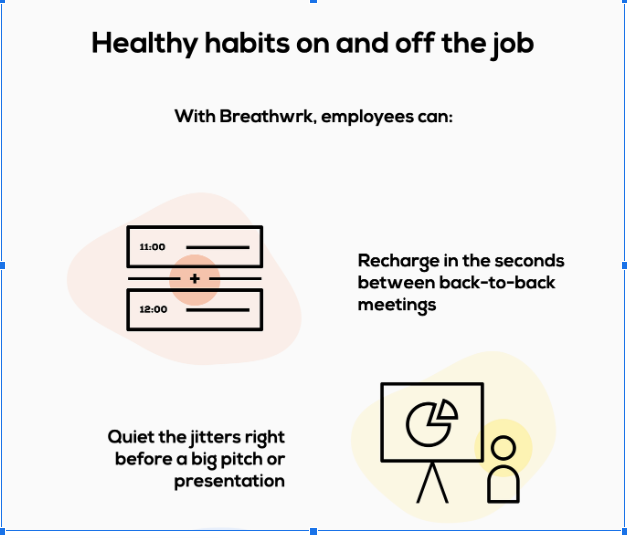
A user is interested in lowering employee stress and enhancing focus between back-to-back meetings, before a big pitch, and doesn’t really care that there is a breathing exercise option before meetings.
By describing how simple it is to set up and manage the app, the sales copy reduces objections.
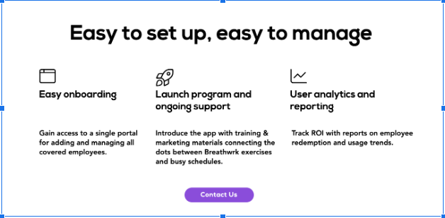
This is crucial because installing a stress-reduction app is the last thing an organization needs.
User analytics (so you can see if employees are using the app and how they’re using it) and simple onboarding are other benefits.
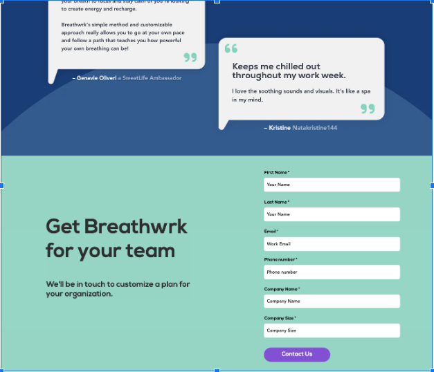
Before the CTA “Get Breathwrk for your team” and form fill, Breathwrk offers social proof in the form of text review quotes.
An outstanding illustration of an app landing page. It attracts attention, displays the product, and describes how it benefits the website visitor.
Final Thoughts
In general, a great landing page aids website visitors in choosing what to do next.
When creating a landing page, some elements to take into account are:
- The layout draws people in and keeps them focused on the intended outcome.
- Copy is concise and devoid of filler.
- Make use of FOMO and social proof.
- Keep objections to a minimum and have a clear CTA.
- Ensure that it loads quickly.
Don’t forget to set up analytics so you can track and analyze user behavior. The key to your success will be testing.